Data Visualization
A page containing visualizations for various projects and occasions.
Visualizations will be accompanied with a link to the source code () and sometimes an interactive version or further reading in a blog post (). Only selected visualizations are shown below.
Enjoy!
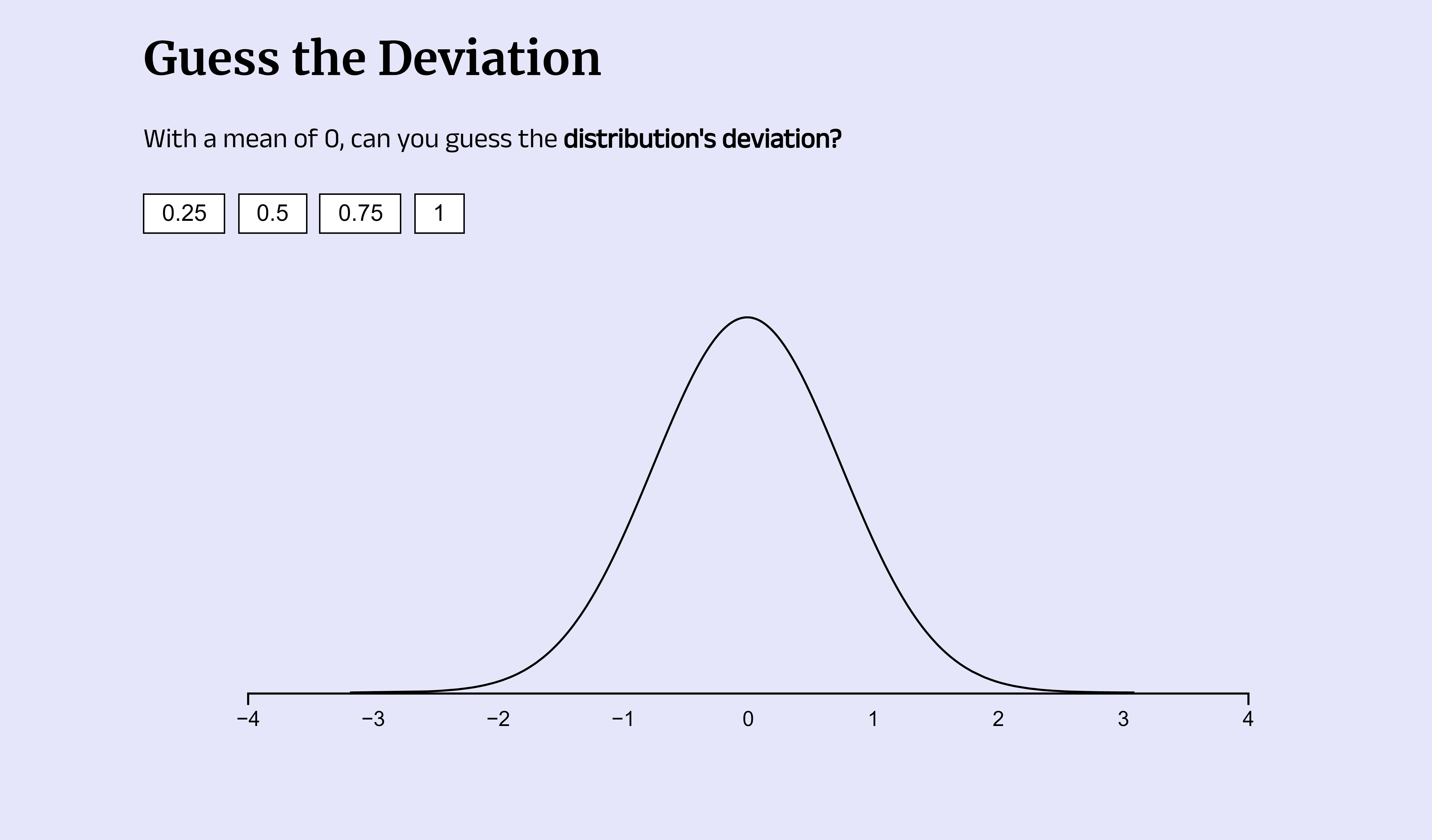
Miscellaneous visualizations
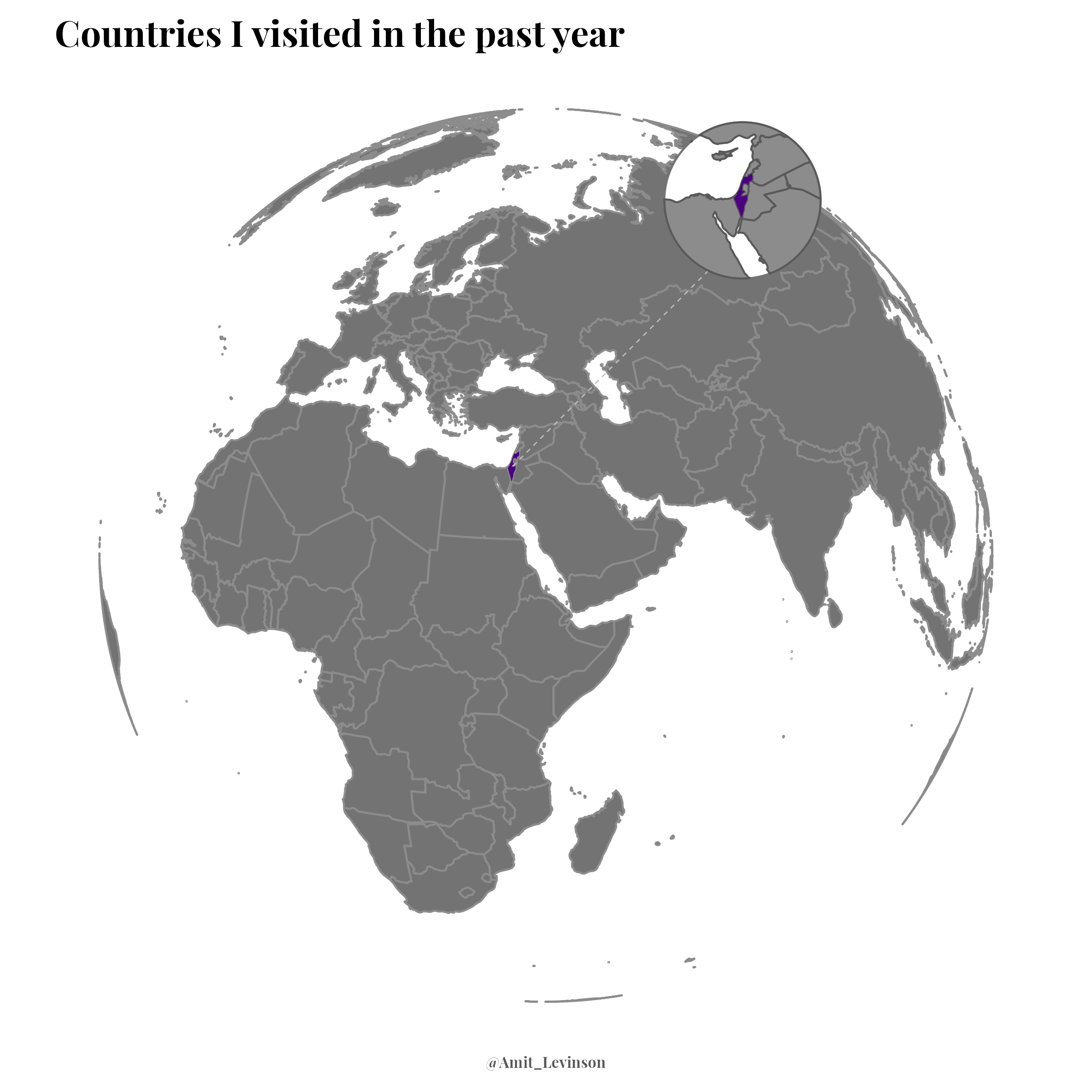
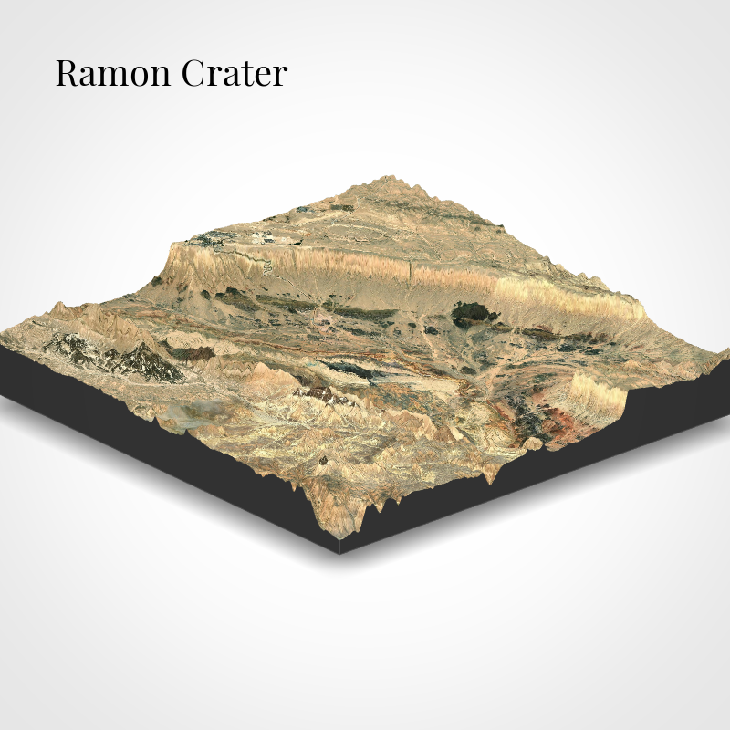
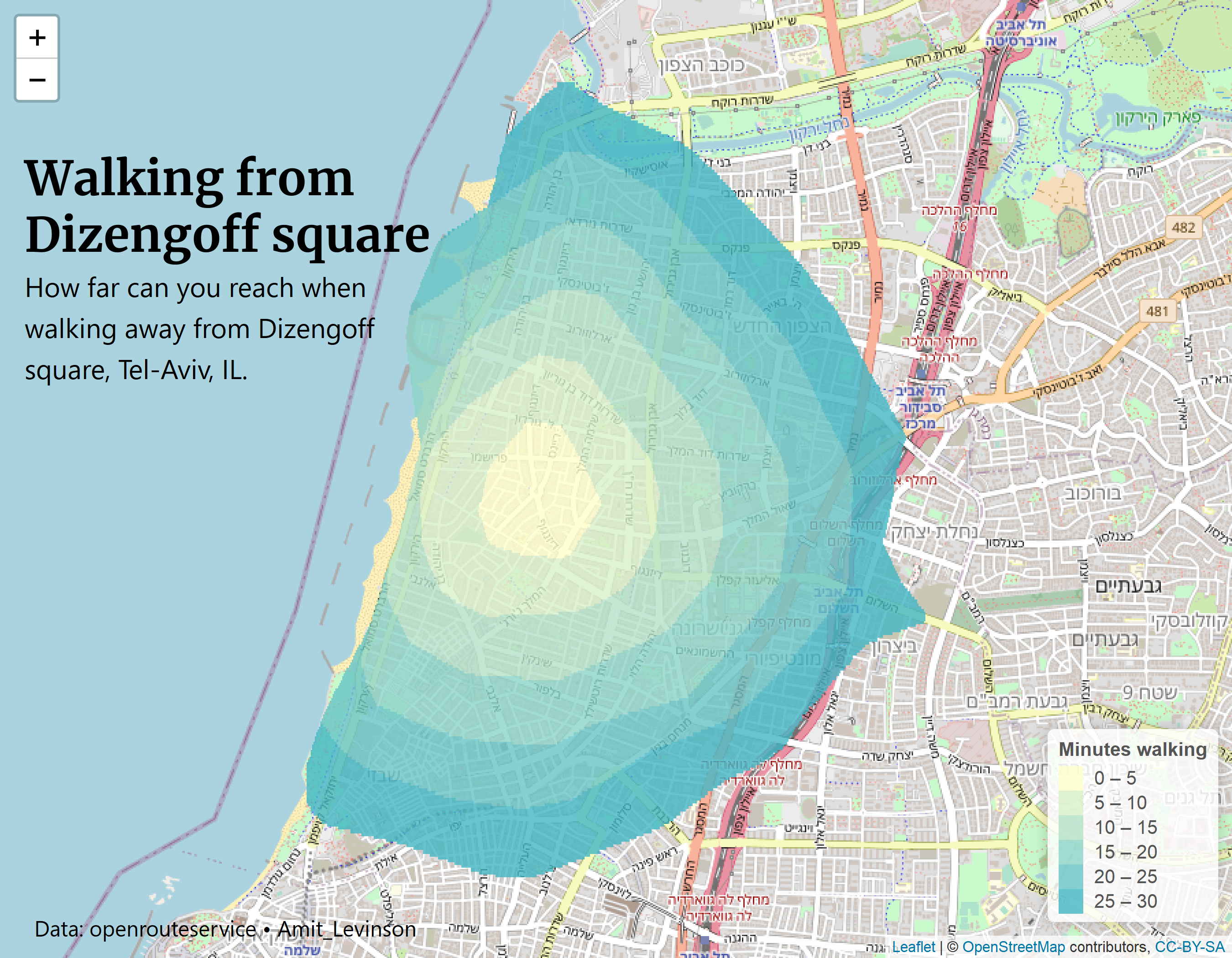
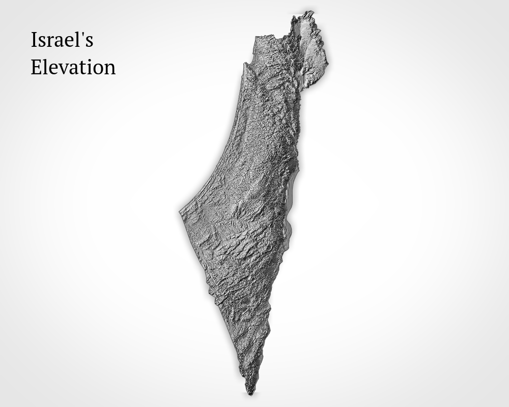
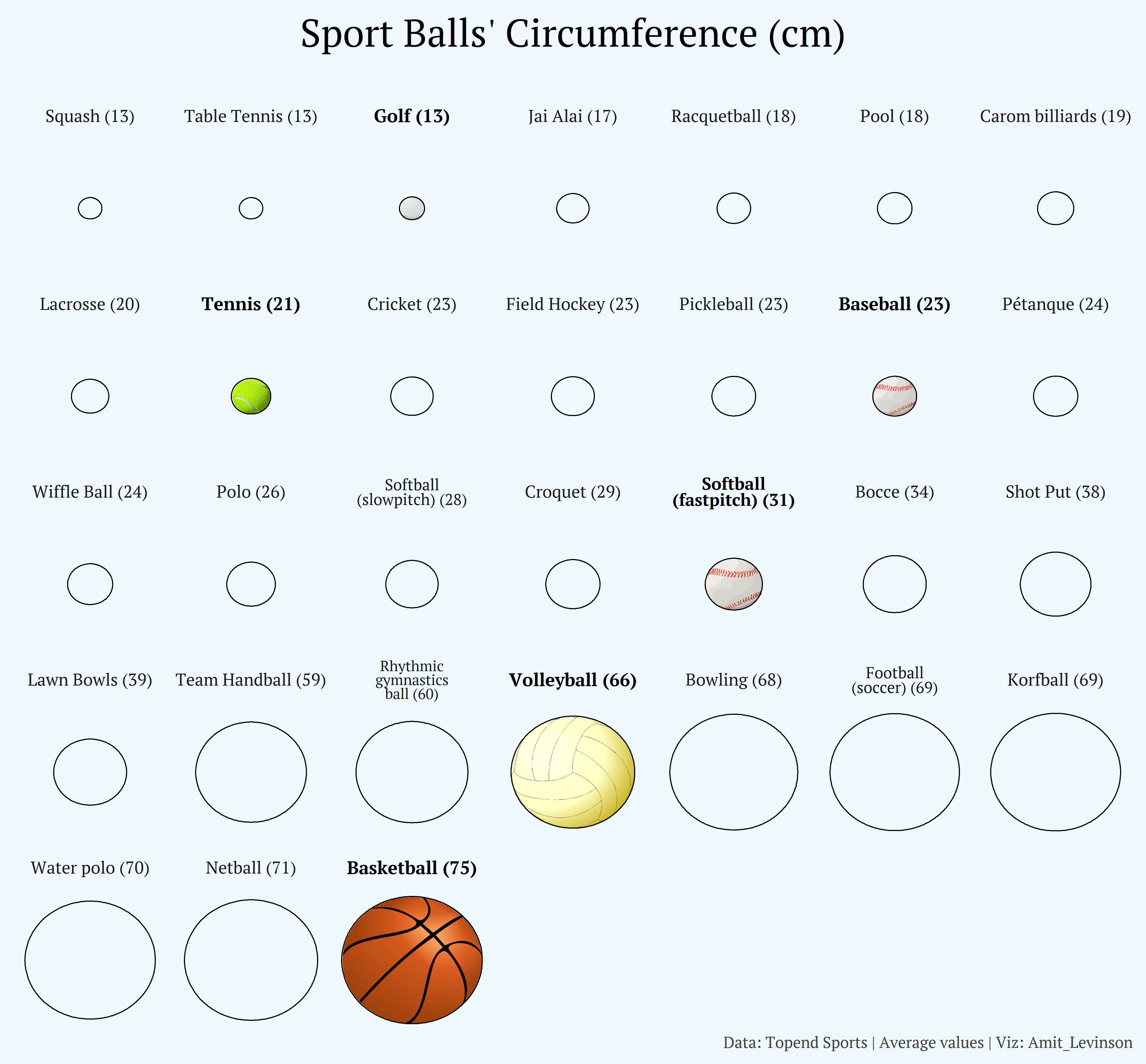
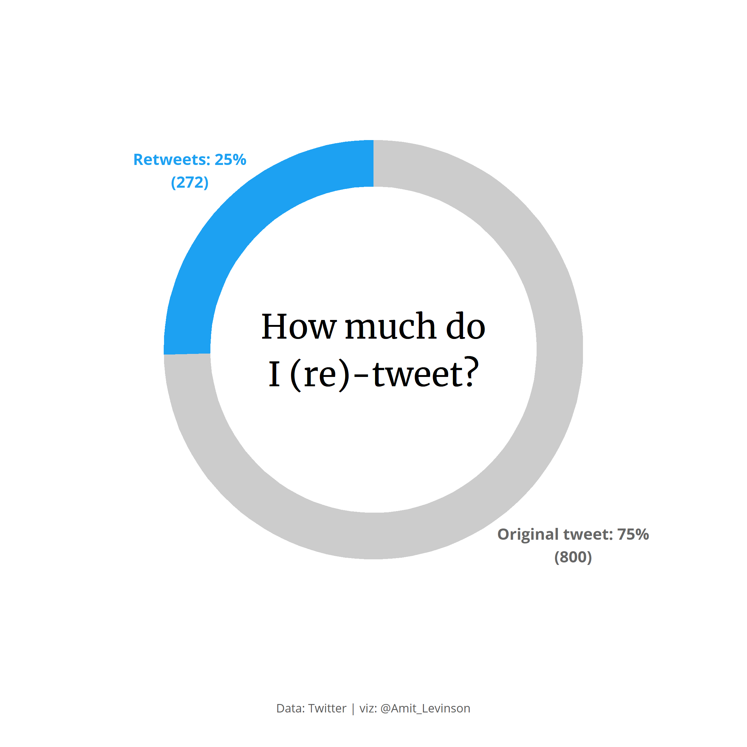
Visualizations I created for random occasions (e.g. leisure, interest)


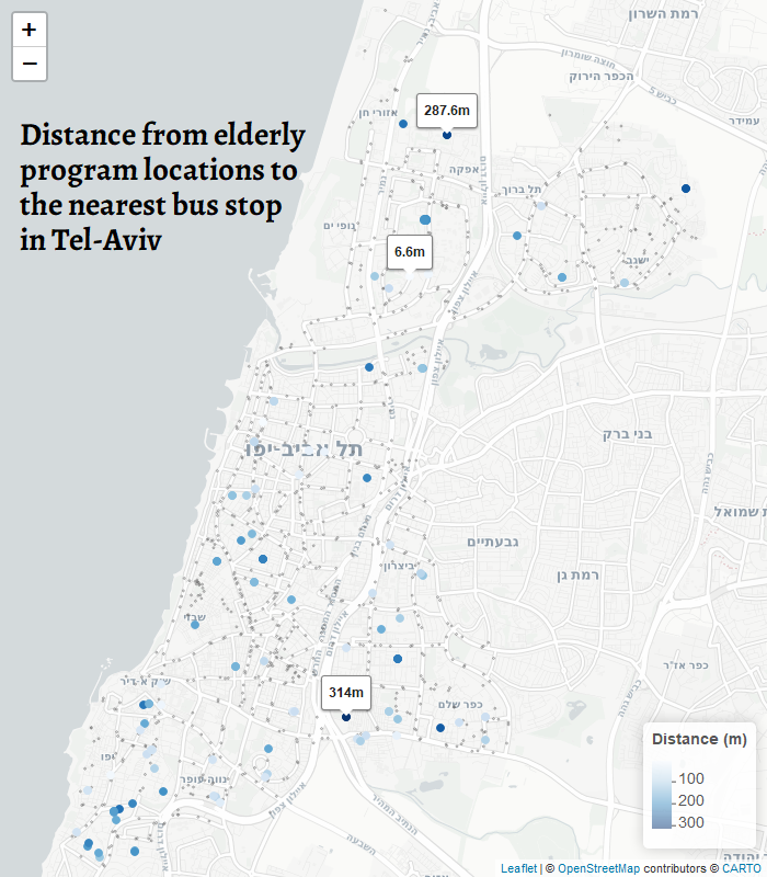
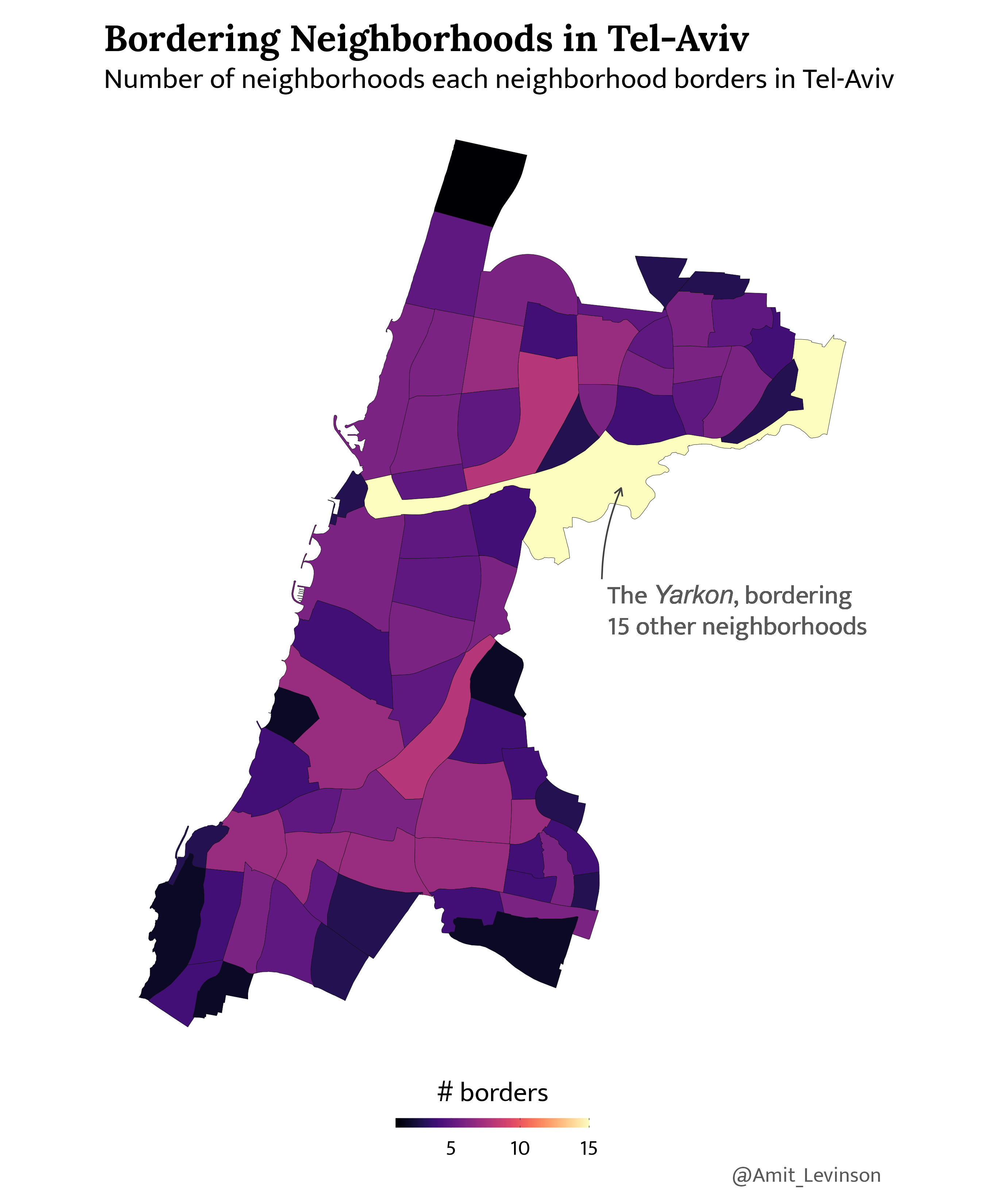
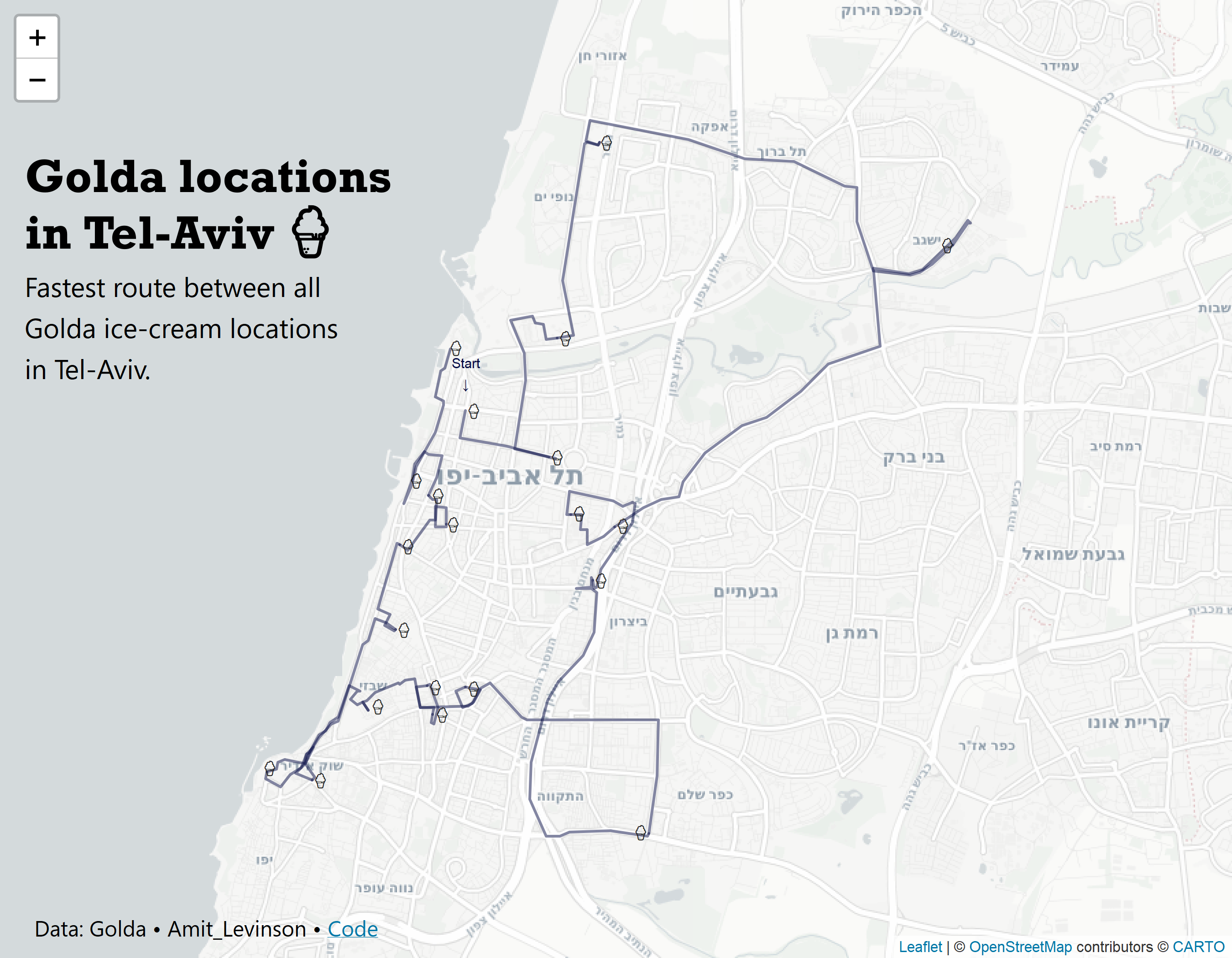
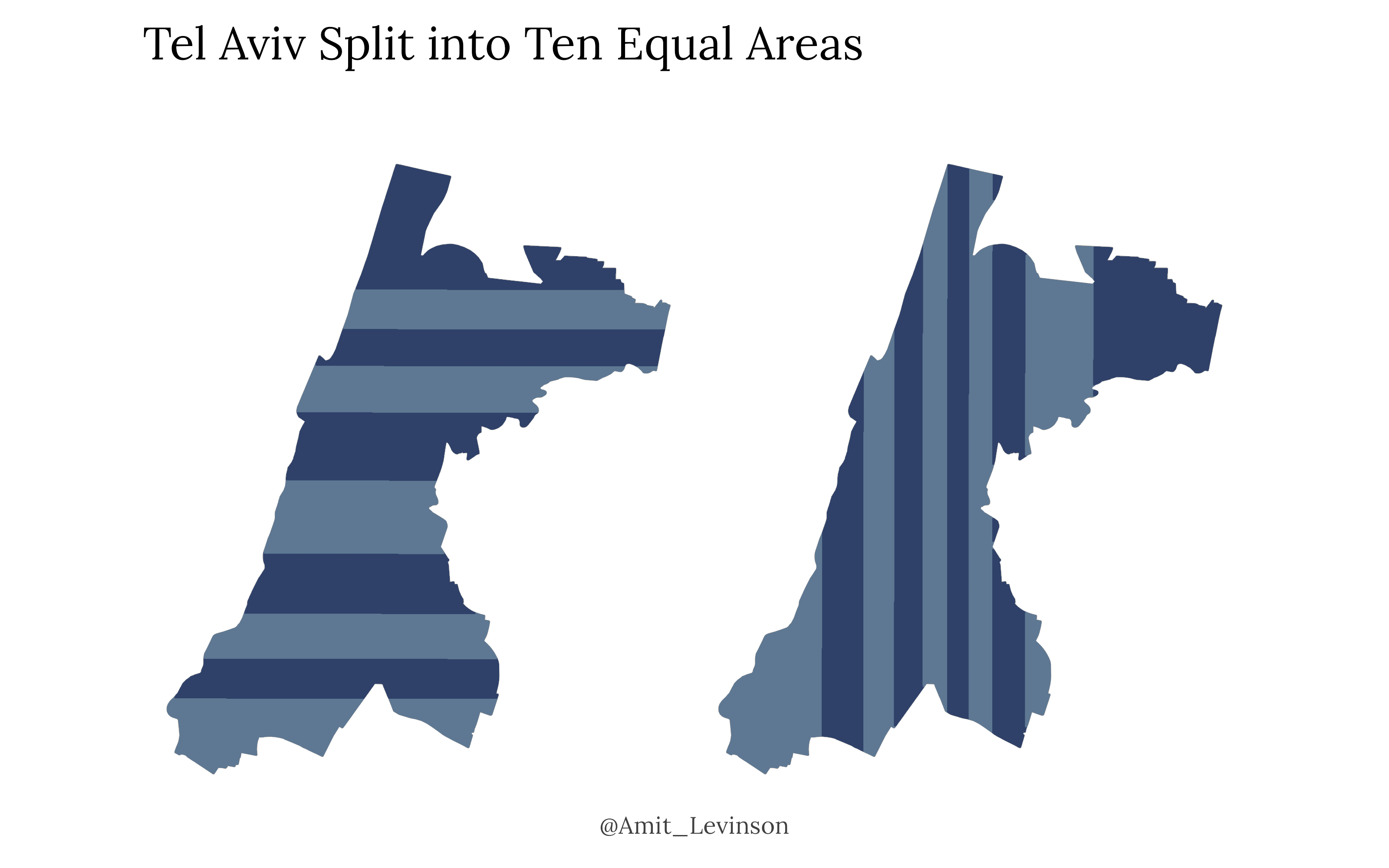
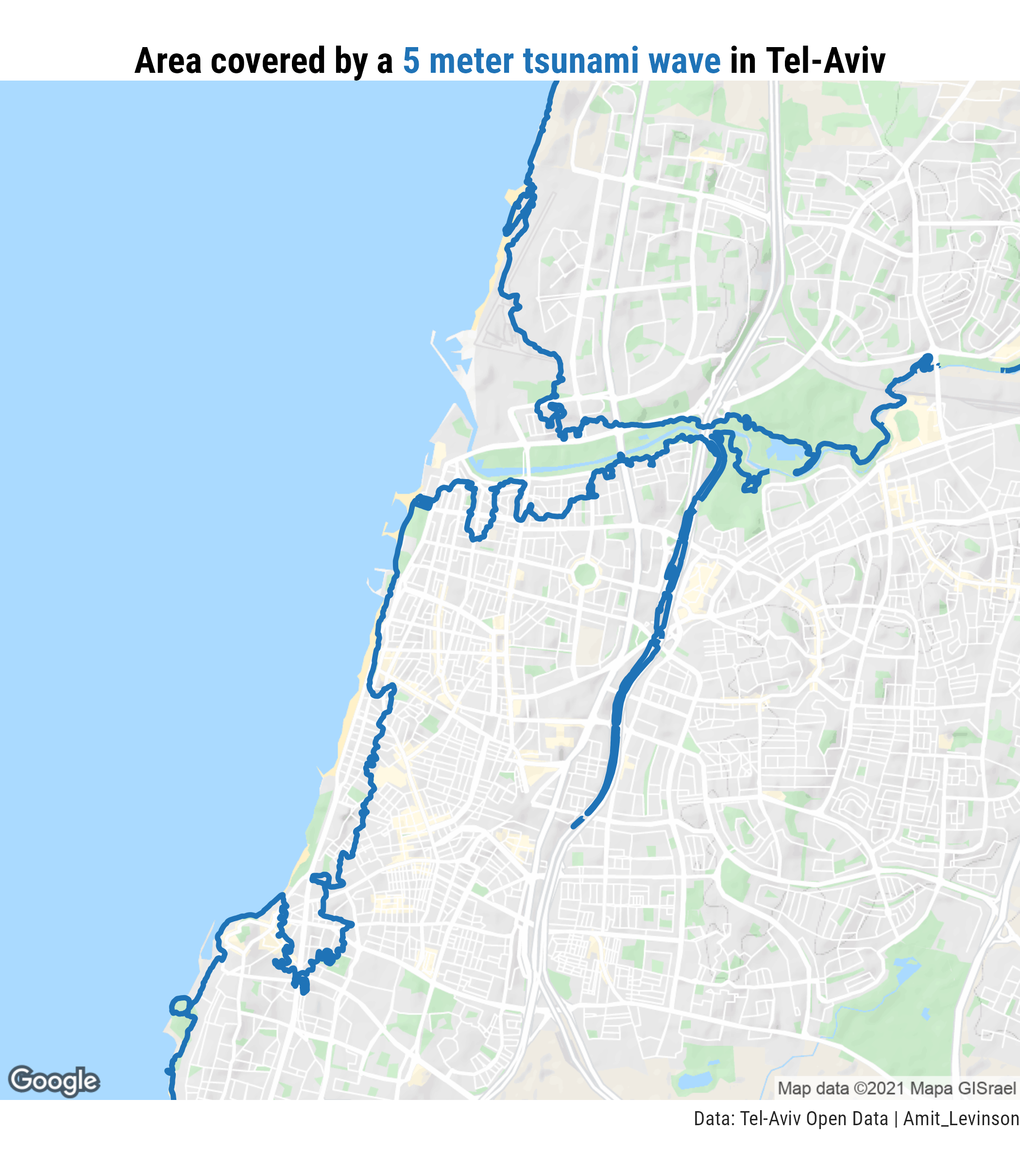
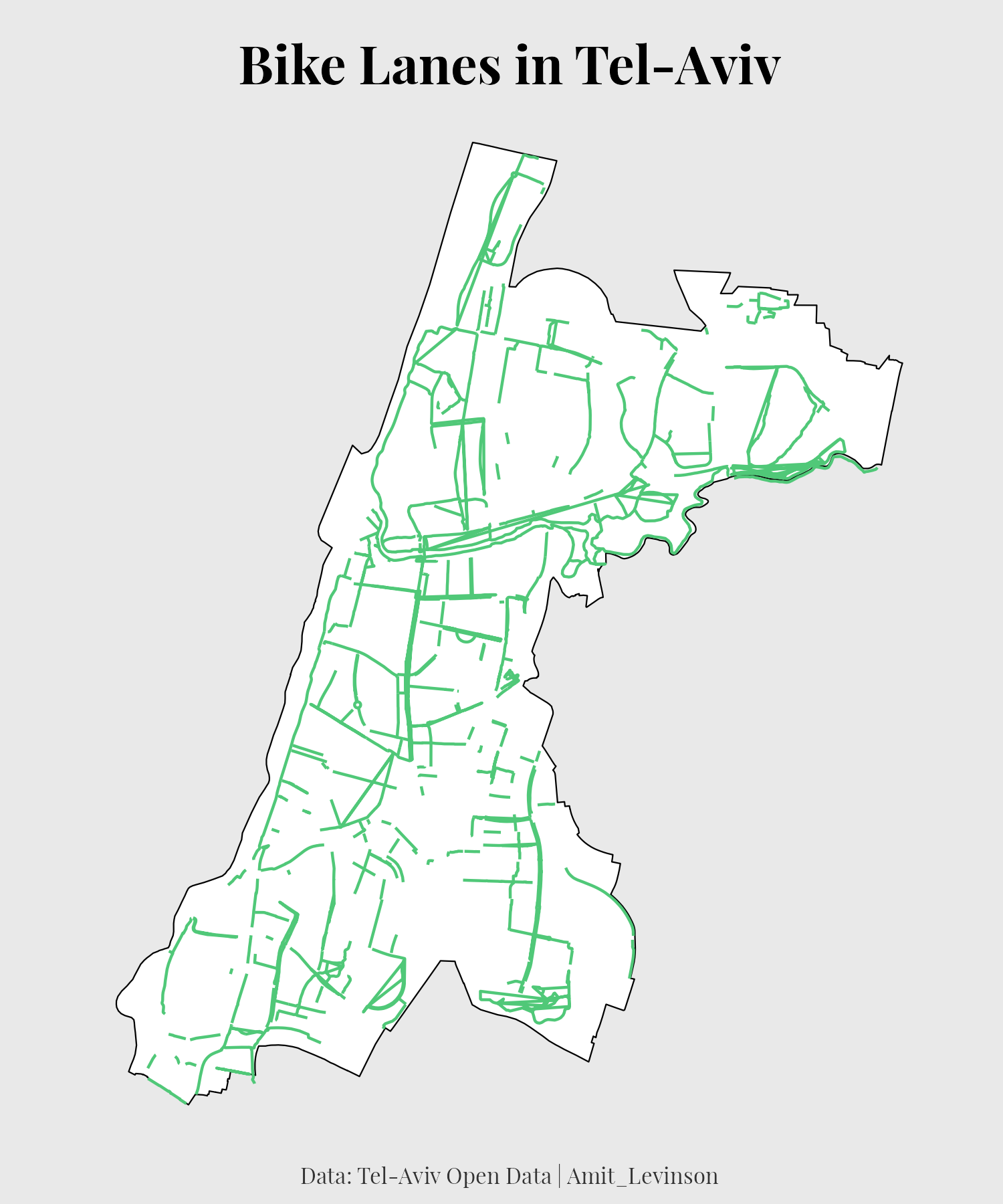
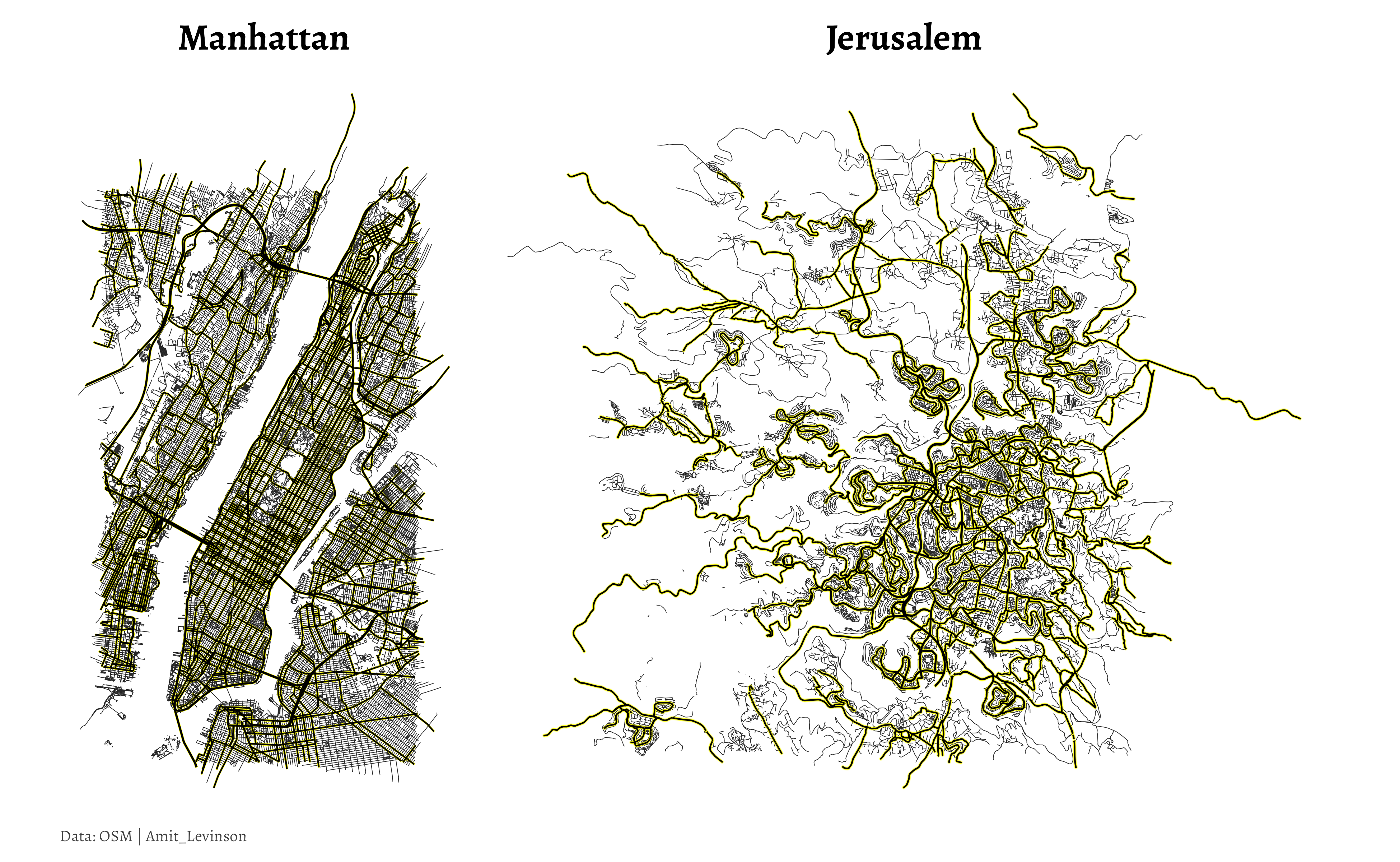
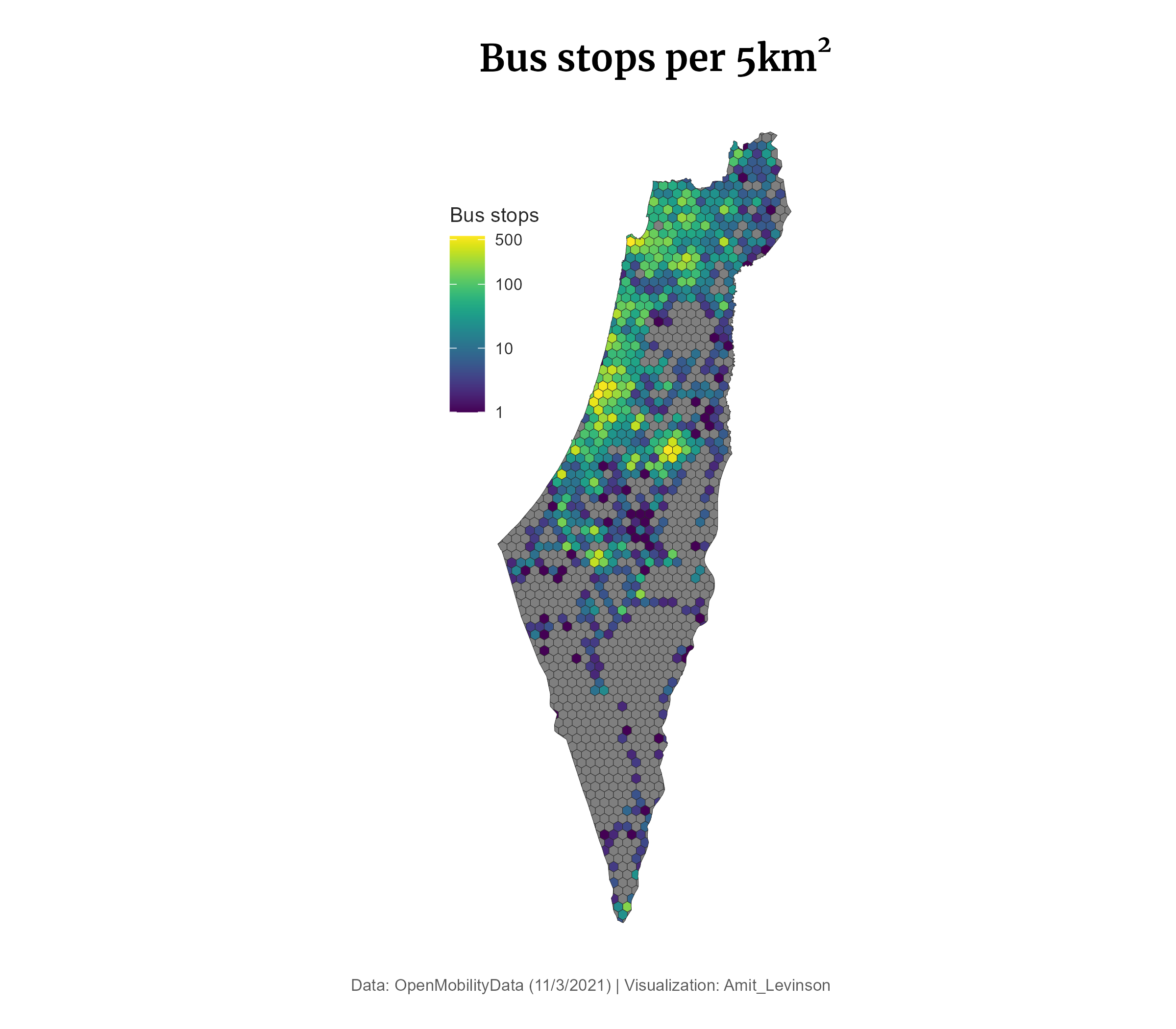
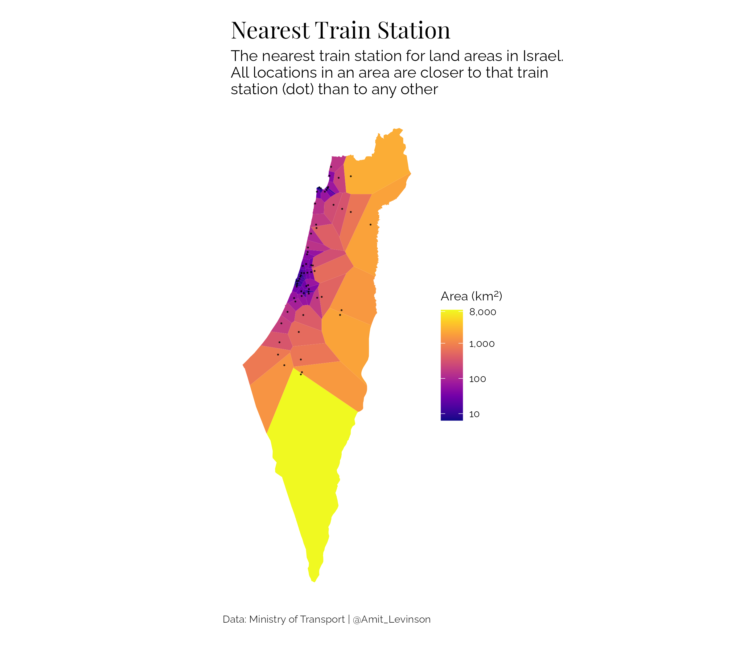
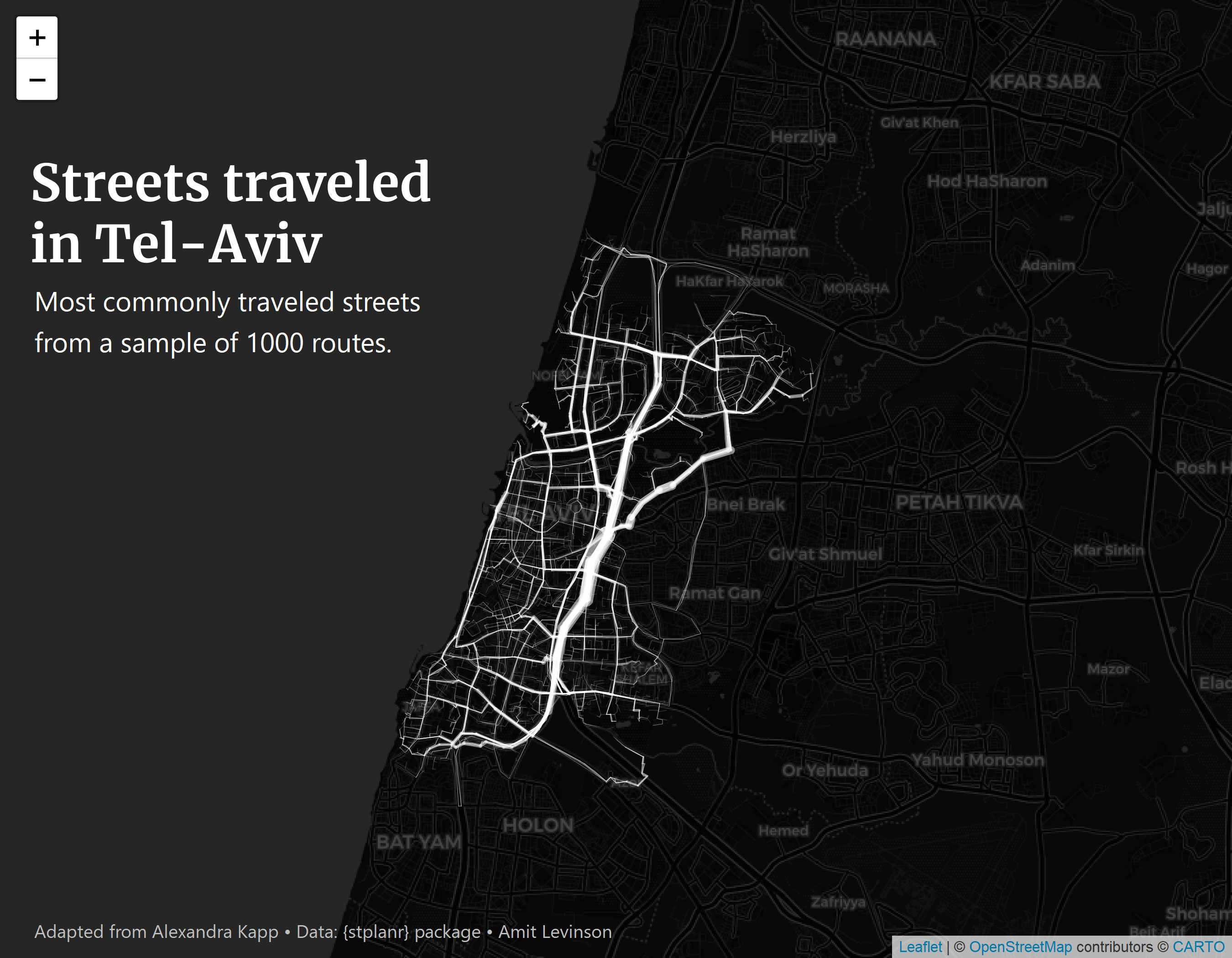
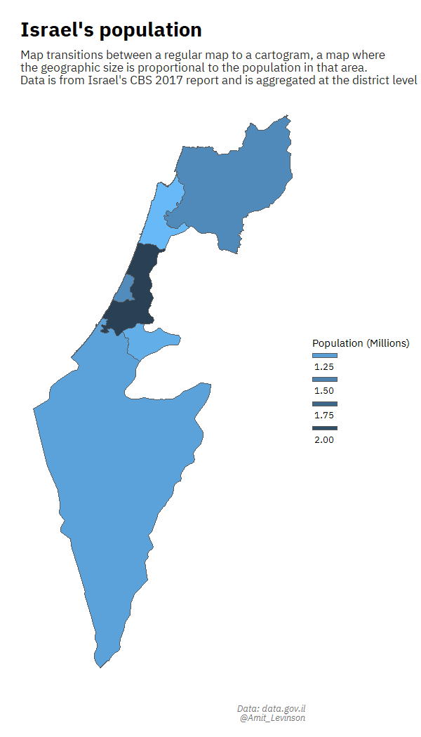
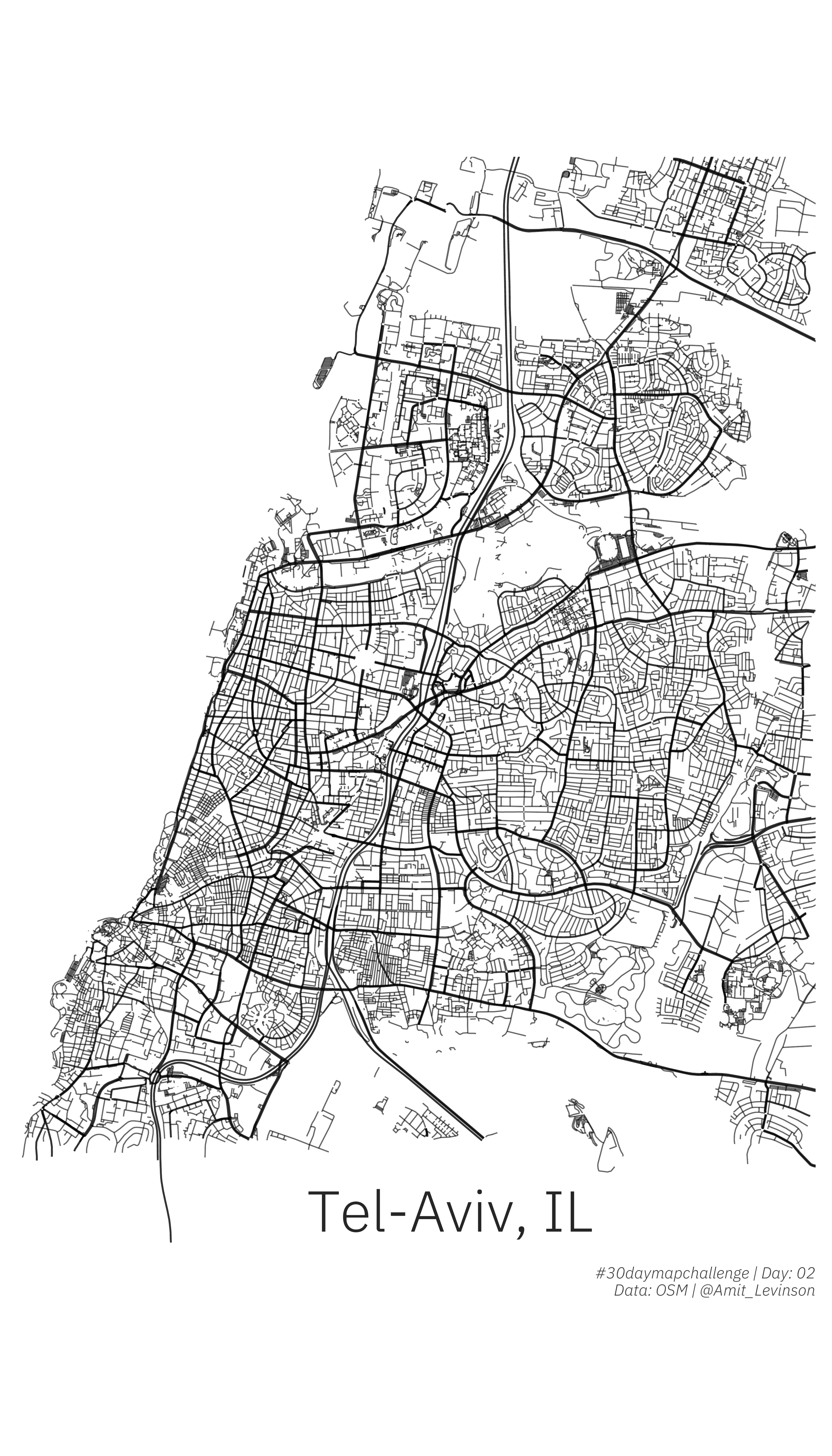
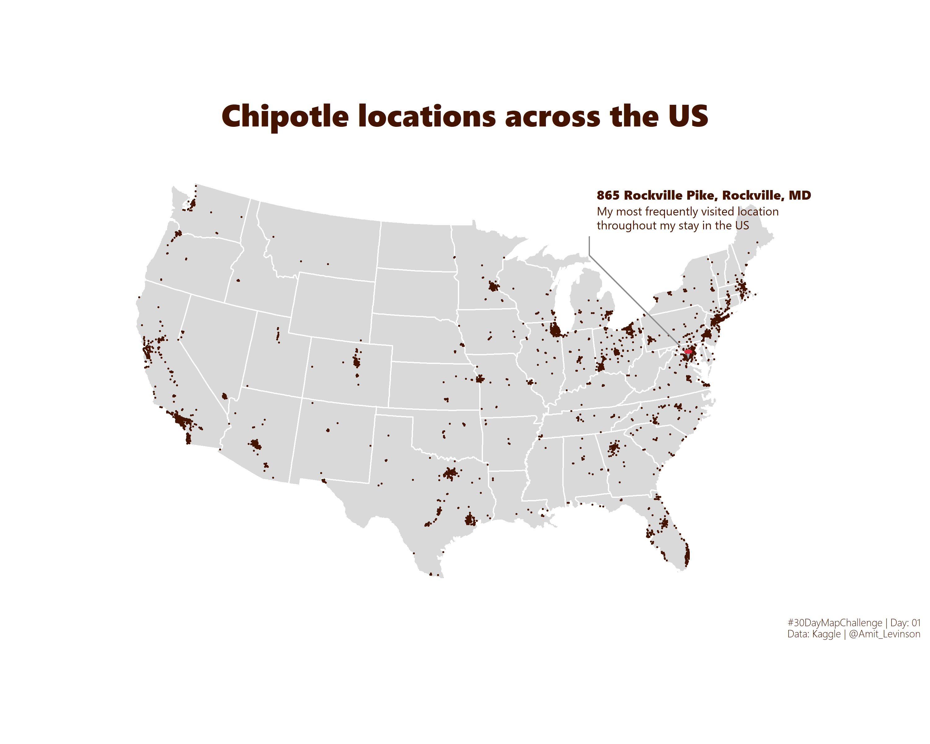
30DayMapChallenge
A daily mapping visualization challenged aimed at the spatial community throughout November (read more here). I only participated on some of the days but it was a great experience learning more about maps, especially for 2021.
2021
2020
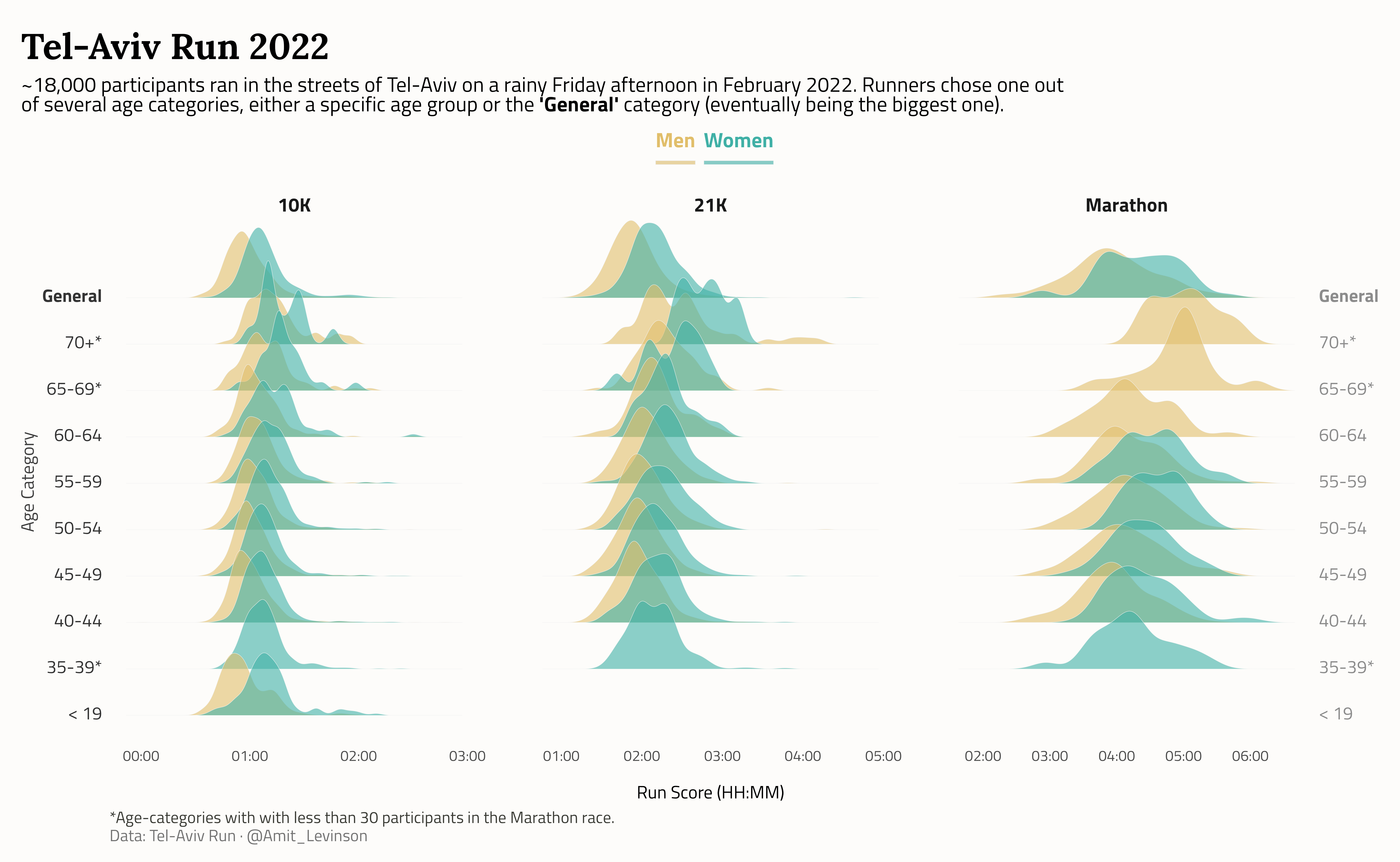
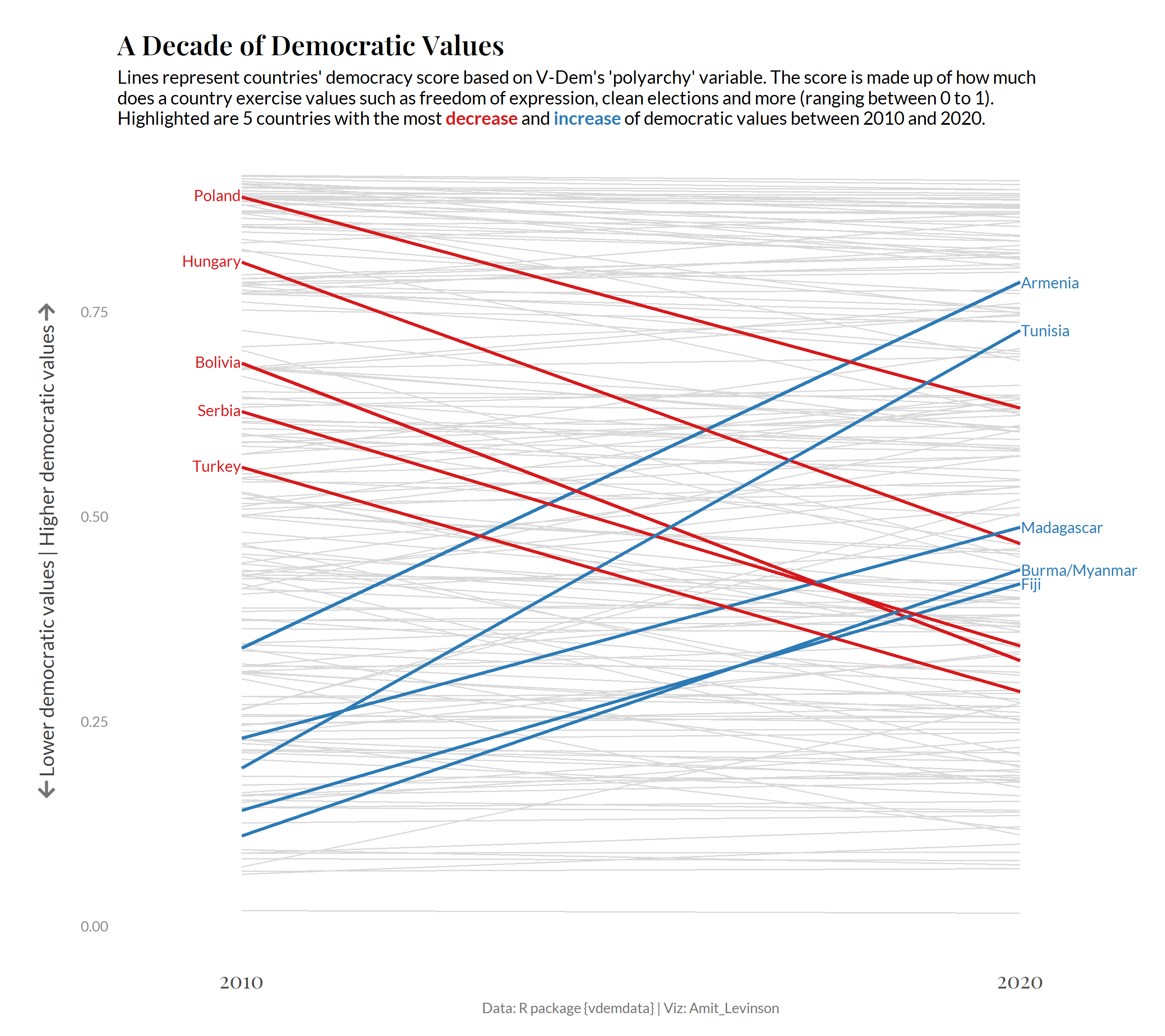
30DayChartChallenge
A daily visualization challenge across several themes throughout April using any tool. Learn more about the project.
2022
All contributions on GitHub


2021

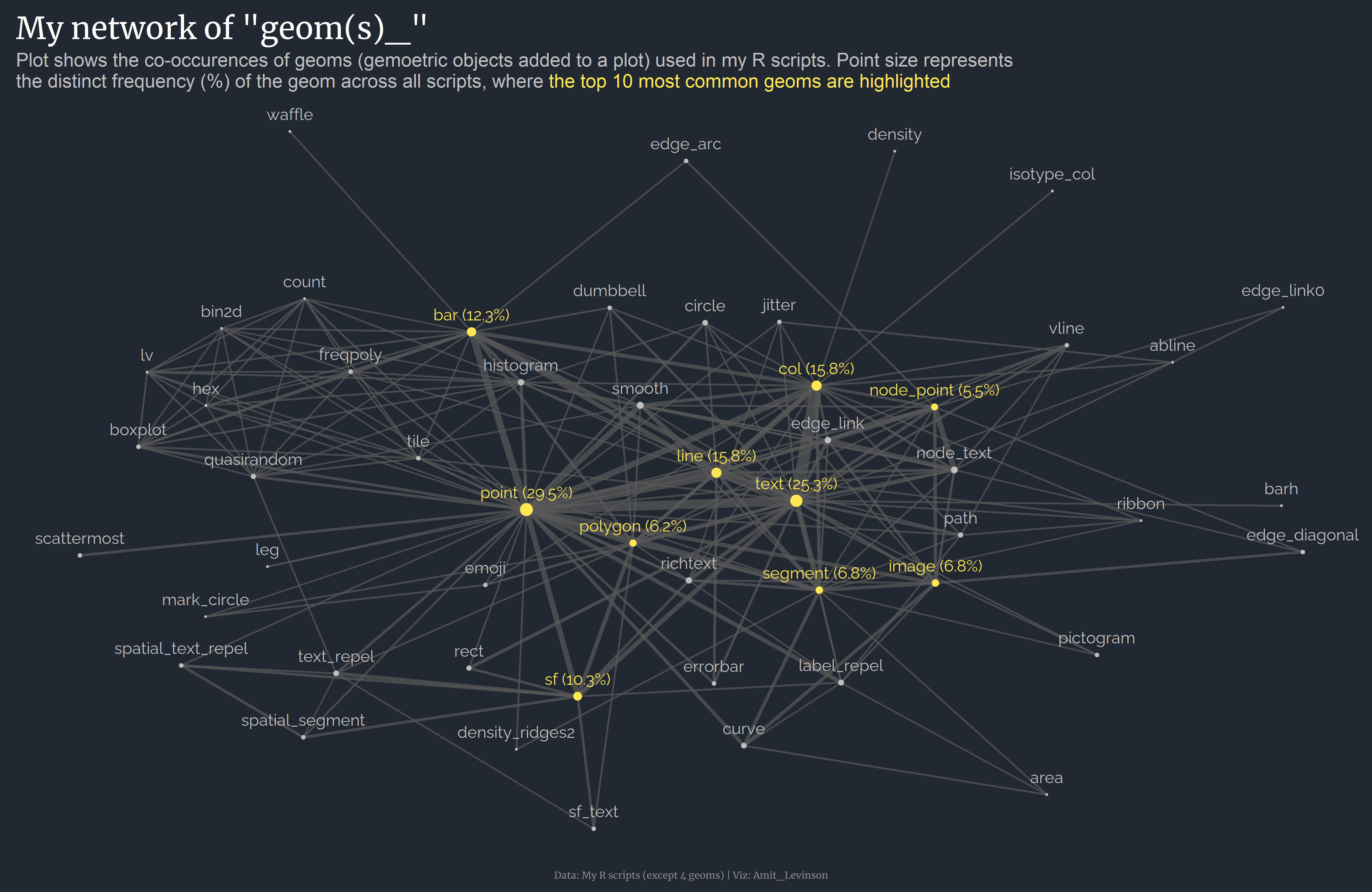


TidyTuesday Project
“A weekly data project aimed at the R ecosystem… [A]n emphasis was placed on understanding how to summarize and arrange data to make meaningful charts”. Fantastic project to practice data visualization. See the Project’s GitHub page for more info.