Community visualization challenges and their educational inspiration (talk summary)
By Amit Grinson
June 28, 2022
Check out the recording of the talk
A little more than a month ago, on May 12, 2022, I gave a talk about my experience in several data visualization challenges I participated in recent years at the Israeli Visualizaiton conference. It was great to summarize what I took from these challenges and while you can find a recording of it online, I thought I’d also summarise it with a little more than I could say in those 8 minutes.
I’ll also take this opportunity to thank my wife — the night the call for talks closed I came to her and said “Never mind, I’m not going to submit anything to ISVIS, what can I possibly talk about”. Luckily she convinced me otherwise, and this talk was born out of it. Thank you ❤️
Visualizations together: Community visualization challenges and their educational inspiration
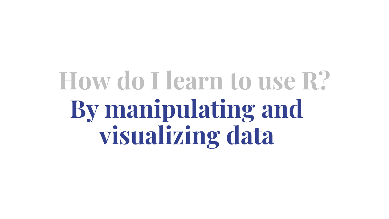
I actually discovered data visualization challenges somewhat by chance. When I started thinking about my MA thesis (somewhere in 2019) I realized I wanted to analyze it in something other than the SPSS we learned, and was recommended to try out the R programming language.1
I didn’t want to wait for my thesis data to arrive, only to be unable to analyze it, and in order to be able to do so I had to know how to use R to manipulate and analyze data, which eventually led me to data visualization challenges.
In the following sections I want to share with you what it is I love about and learned from these challenges, with the hope to motivate you (and future me) to participate in an upcoming one if you haven’t yet given it a try.
Community
As I was roaming across Twitter one day I came across the #TidyTuesday challenge, a data visualization challenge oriented towards the R community. Every week a new dataset is published and the R community is invited to analyze and visualize it.
Observing as a spectator for a few weeks I decided to participate in week 39, 20192. Doing a quick exploratory analysis of the data I noticed a trend, somewhat intuitive, of an increase in the number of visitors to national parks across years. Remembering a plot with added icons from the week before by Ariane Aumaitre, I adapted some of her code and posted my first plot in R.
My first attempt at plotting in #rstats 👏
— Amit Grinson (@Amit_Levinson) September 18, 2019
took the #tidytuesday opportunity to get some practice and plot the average number of visitors at national parks per year.
icon inspiration from @ariamsita, thanks! pic.twitter.com/sLGUkRl80f
The feedback from the community was amazing. People were glad I joined, wanted to learn how I made the plot, e.g.added the icons, and peek at my code (which took me a few hours to get onto GitHub). I was also amazed that so many people create such beautiful and inspiring visualization I can learn from, and all this for free! I was hooked on the project.
As time went by I joined additional community visualization challenges such as the #30DayMapChallenge and #30DayChartChallenge. In contrast to the #TidyTuesday you bring your own data to these challenges. The challenges occur throughout a whole month, where each day has a different theme and participants are invited to share maps/charts relating to that theme.
While the two challenges differ, I found a lot in common between them: Anyone and everyone are invited, beginners and advanced alike. Plot it in R, Python, Tableau, Qgis and what not. Most importantly, despite never meeting anyone I constantly felt like I was part of the community participating.

Engaging
In challenges where I brought my own data (e.g. 30daysX) I realized that when I brought data that engaged me I was more committed to participate. “But Amit, what’s engaging data?” you might ask. Well this broke down for me into two classes: meaningful and personal data.
Meaningful Data
As someone living in Israel I found data relating to Israel meaningful to explore: I was intrigued and challenged by it, and wanted to answer questions pertaining to it as an Israeli.
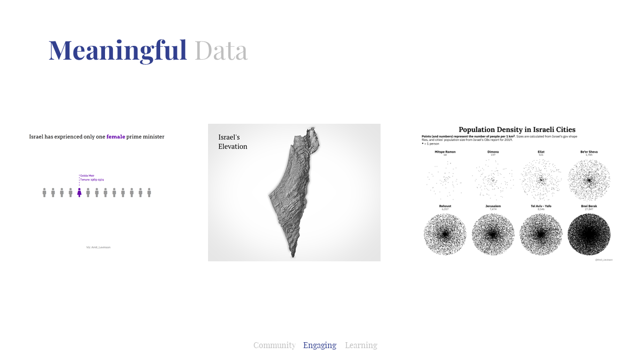
So I accessed various datasets relating to Israel and visualized them, for example previous Israeli prime ministers or visualizing Israel’s elevation. More recently I visualized population density in Israeli cities, a dataset I had laying around and been meaning to explore for a while. It was great to explore Israeli data and also share it with other participants for them to learn more about Israel.
Personal Data
Other data that engaged me was something that related to me personally such as my behavior. Realizing that, I started collecting various data ahead of time so when the challenge started I was eager and prepared to explore them.
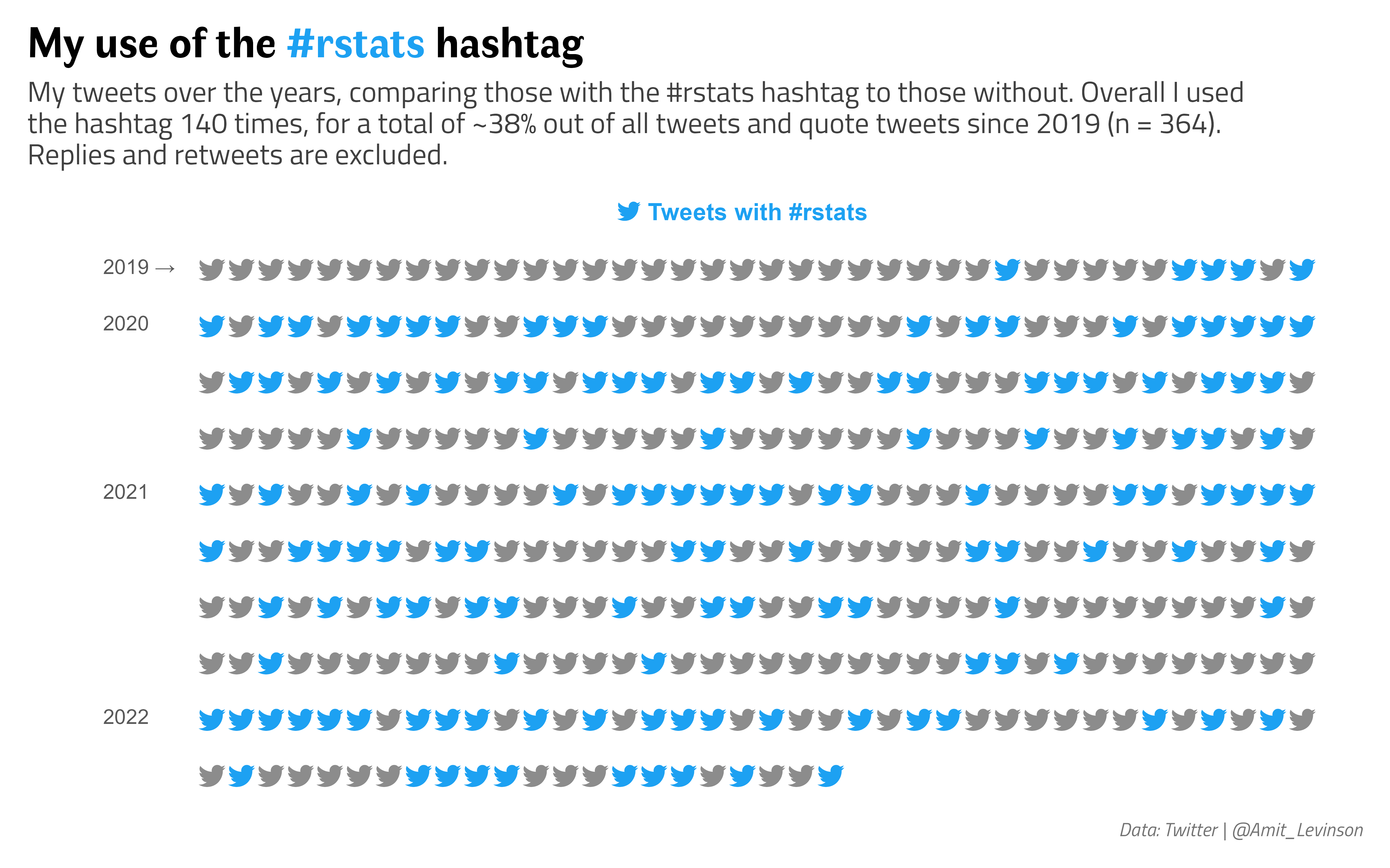
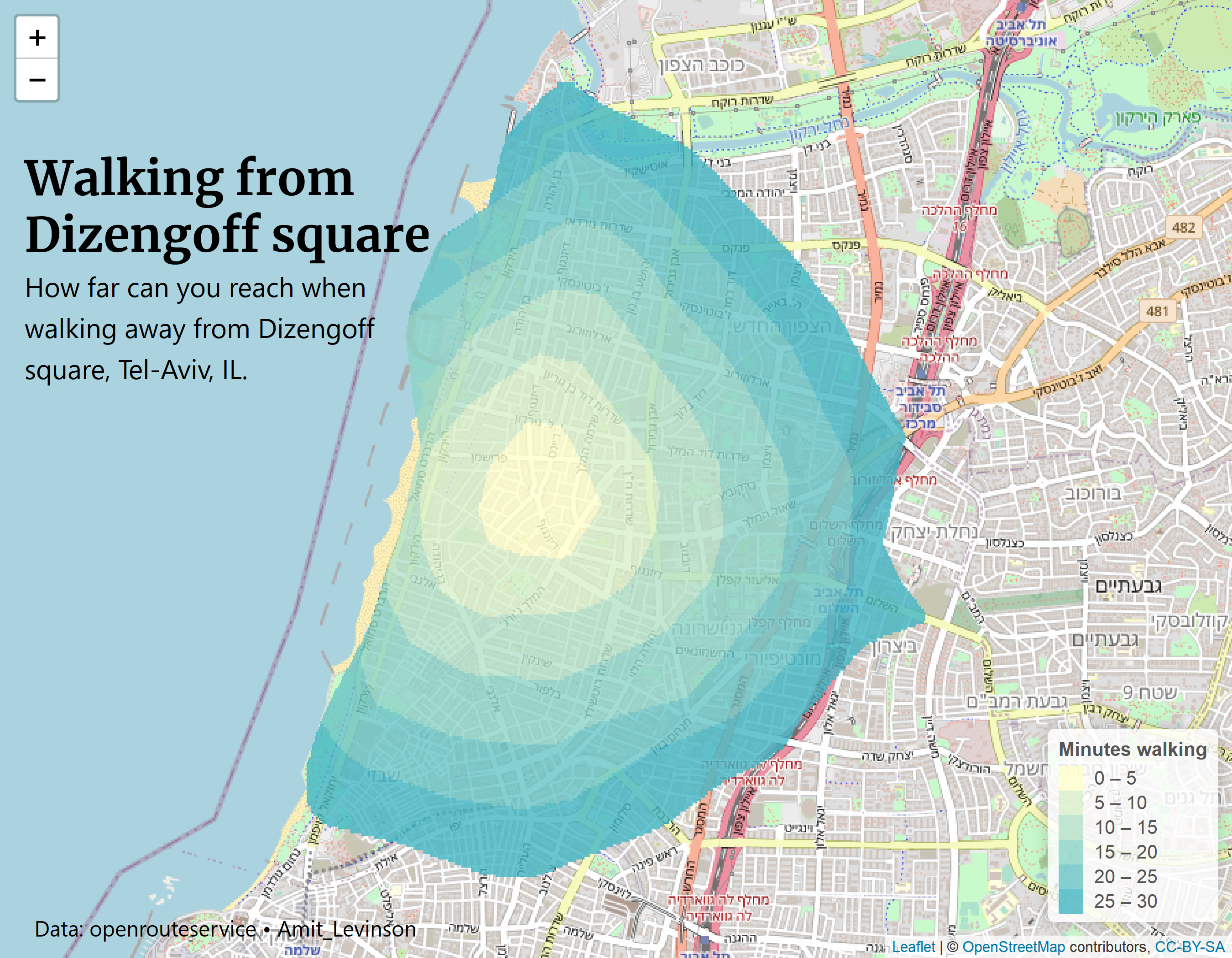
For example as someone who uses Twitter mainly for R–related comments and inspiration I was curious to see how much I use the #rstats hashtag, a hashtag commonly associated with the R community. Alternatively, currently living in Tel-Aviv I frequently walk to Dizengoff square so I was curious to see how long it took to walk to various locations from there.
Meaningful and personal here are somewhat blurry, but I hope it conveys the picture: In challenges where you bring your own data (BYOD 😉) try to find data that engages you, something you’re passionate about or been wanting to explore for a while. Take these opportunities to explore them, build your portfolio or just answer questions you’ve had laying around for a while.
Learning
Learning from others
One of the things I love about these challenges is that many of the participants share their code, which you can then adapt for your own needs and visuals.
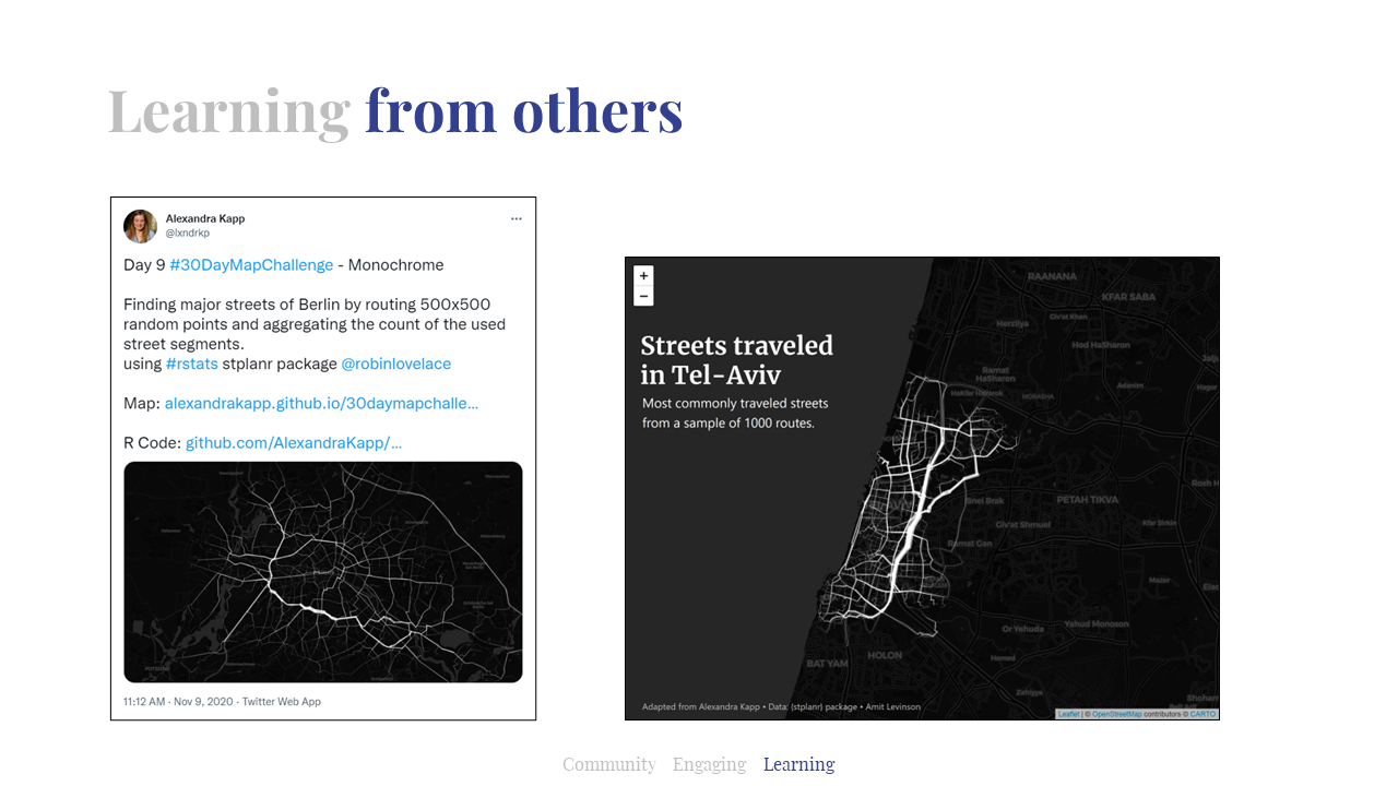
One example of this is during the #30DayMapChallenge in 2020 Alexandra Kapp published a map of frequently traveled routes in Berlin using simulated data. What she did was, to my understanding, elegantly brilliant: She sampled two points in Berlin and calculated the shortest route between them. She did this for 500 pairs of points and plotted the routes traveled on where the line width represents the frequency of the street traveled compared to all other streets.
Seeing this and amazed by its simplicity I adapted it for my own needs: The next year I ran the same analysis on Tel-Aviv, producing the plot on the right.
While this was one example, incorporating others' code is something prevalent in a coder’s life: You find an answer on Stack Overflow or in some GitHub repository and adapt it to your current need. These challenges provided a great lesson in how to take someone else’s code and integrate it to what it is you’re trying to produce.
Learning new tools and methods
Somehow I find this idea - learning new tools and methods - somewhat redundant. I mean, unless you’re proficient in the language you’re using, you’re likely to encounter some challenge you will learn from. With that said, pointing them out really helps to look at at one’s accomplishments.
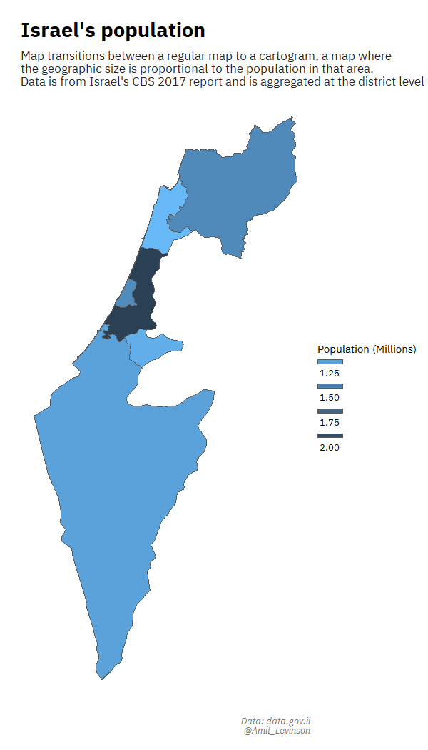
For one of the days in the first #30DayMapChallenge in which I participated I wanted to create a regular map transitioning to a cartogram. I remember sitting for days trying to work the code, even while following various blog posts. Something constantly went wrong: I had the data in a different format, the post referenced an older version of the package and more. And yet, the feeling after succeeding was great, realizing I gained and learned a lot from the process on using the specific functions.
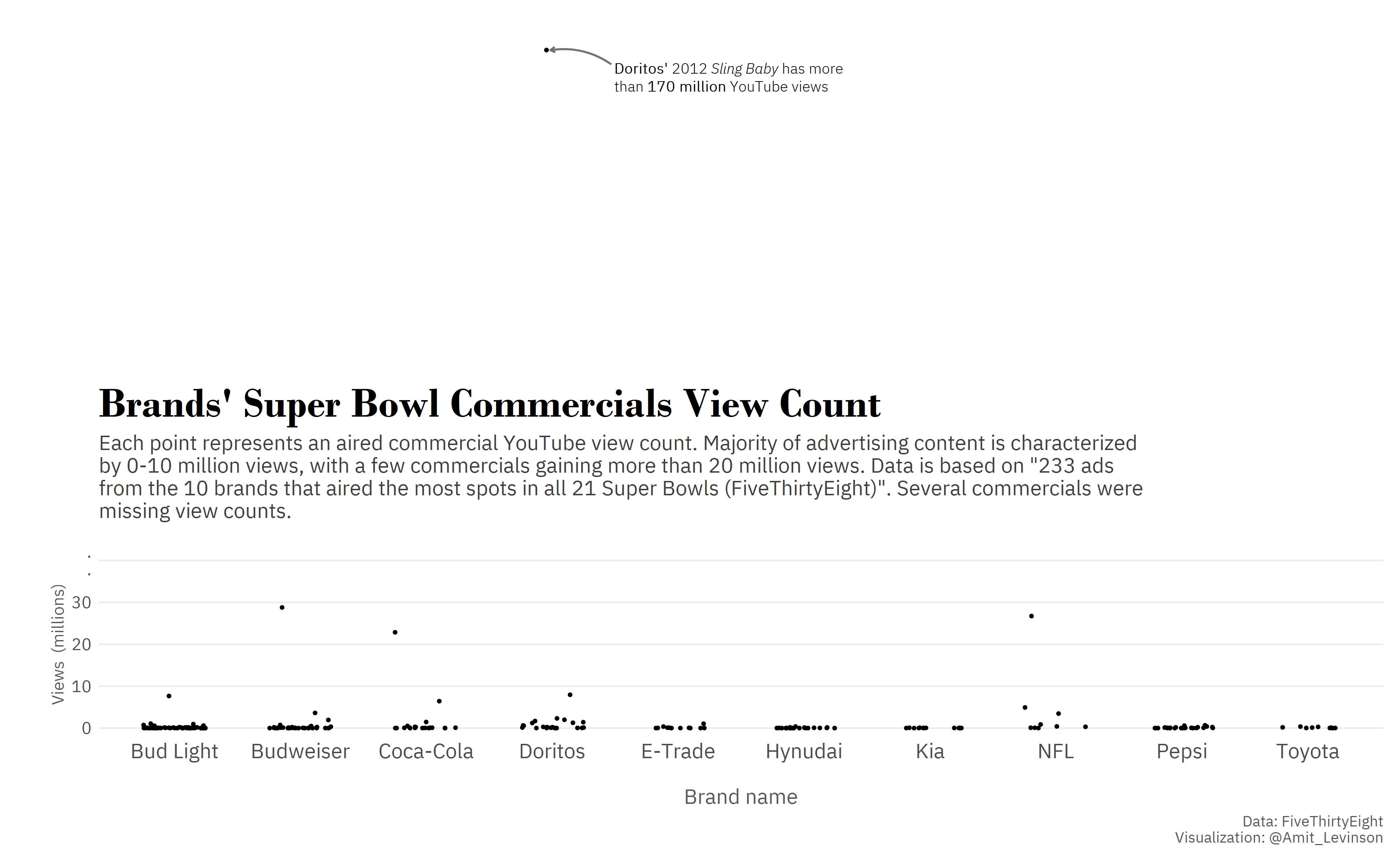
I also got to try out different ways of representing data, such as trying to plot data with an extreme outlier, leveraging the area above the plot to highlight the extreme distance from other points.
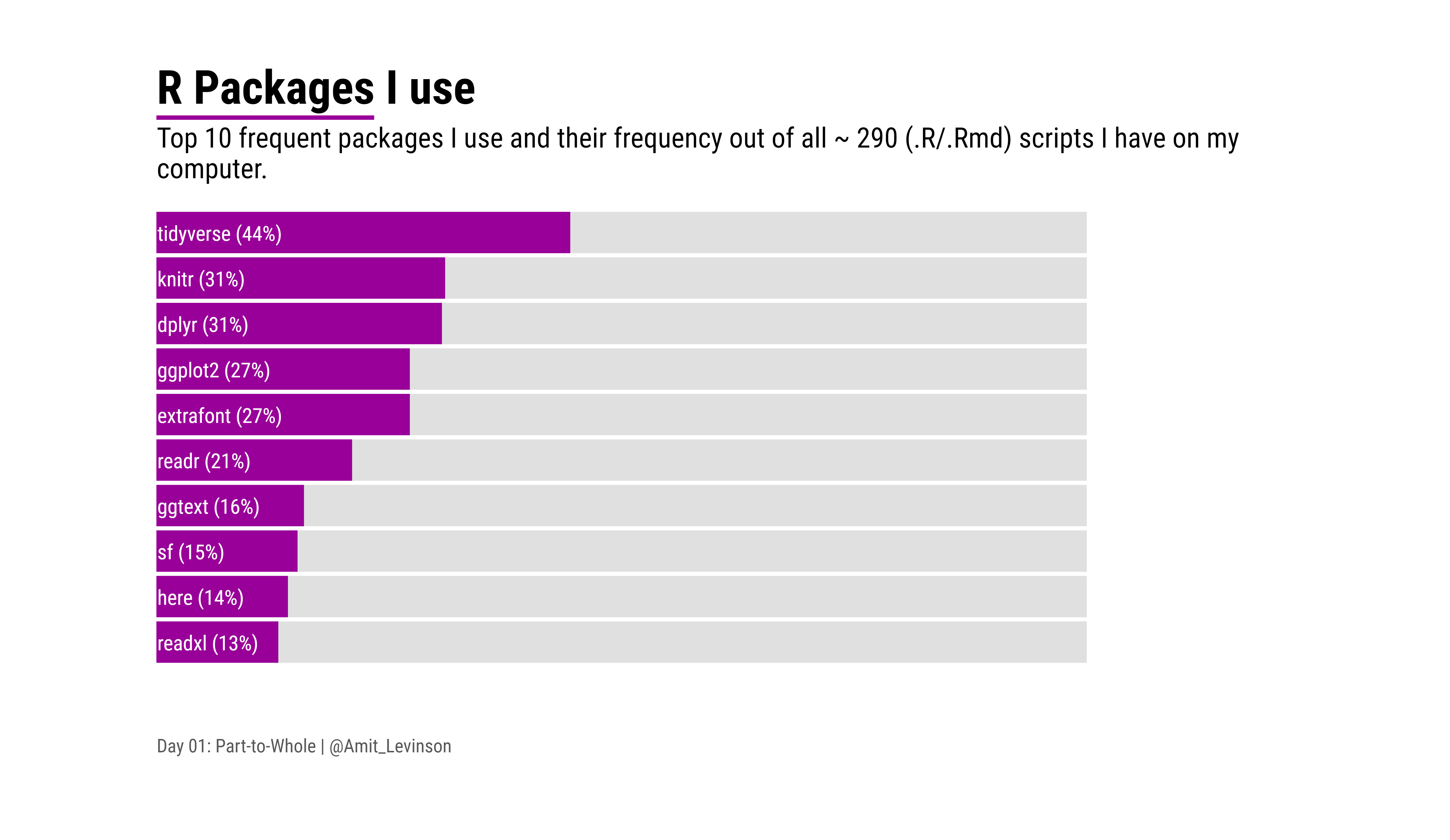
At another time I wanted to try out a new tool, so after collecting and aggregating data about the R packages I use I visualized it using D3.js, something I hope and look forward to exploring more in the future.
What I love about these challenges is even without deliberately attempting to challenge ourselves it happens: The data is slightly different than what we’re used to, we try out one new function and other things that expand our knowledge one step further.
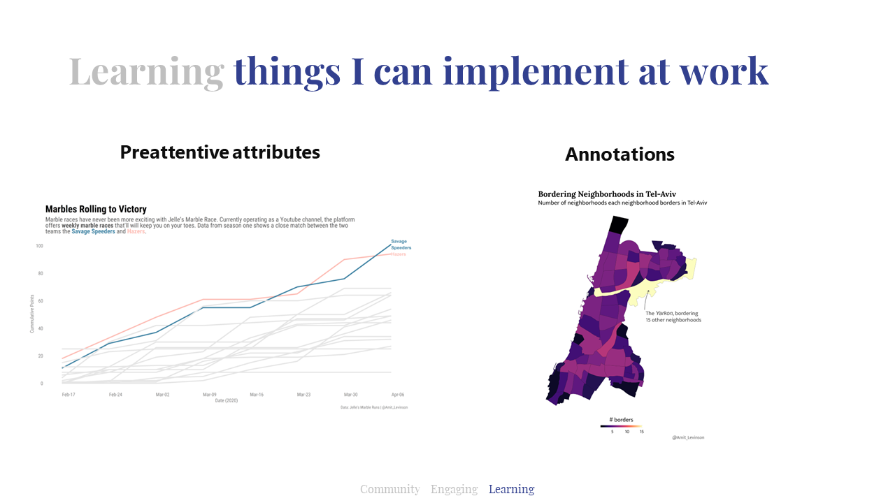
Learning things I implement at work
As I created charts at work I noticed I would translate a lot of practices I implemented and experimented with in challenges to the charts I produce at work as an analyst. For example, the idea of pre-attentive attributes and their implementation in charts: how do I guide my reader through the chart, showing him where to focus first, second and last. Using color, bold text, miniamlism and much more to guide the reader’s attention. At other times it was more specific things such as annotations and using them to guide the audience to the main takeaway at hand.
Sometimes it was even more subtle things, such as having a repertoire of graphs to choose from or choosing the right one for the data I wanted to present. Either way, I realized that participating in these challenges made me a better communicator and analyst
Recapping
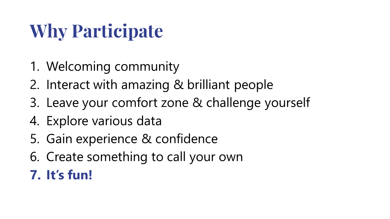
Why Participate?
So if I’ll try to recap my experiences, what I took from these challenges and why I think you too should join too then it’s because of the following:
-
Welcoming community — The communities in the challenges I participated in were extremely welcoming. Come with any level of experience and whatever tool you use. Everyone is welcome to participate as much as they want. This is great especially if you’re a beginner and need that safe place to start your journey.
-
Interacting and being inspired by amazing people — It’s amazing how many people I learned about and got to interact with from these challenges. My Twitter feed has grown drasticaly, following many of the participants' sharing and work they continue to share.
-
Invitation to leave your comfort zone and challenge yourself — These challenges, in effect, constantly push your limits: A new dataset, a new function or a new tool altogether; every theme comes with new and exciting challenges to overcome and learn from. Just grab them closely and embrace the opportunity to try out something new.
-
Explore various data — Since you bring your own data to some of these challenges it’s a great opportunity to explore data you had laying around or something personal. And when the dataset is provided you get to analyze different topics and formats of data such as text, time series, networks and much more that you (or at least I) don’t usually get to explore.
-
Gain experience and confidence — As I coded and participated more I became better and more confident in my ability to analyze data. And as to my original purpose, when I got my thesis data I was all ready and confident to analyze it (thouh I did stilll encounter difficulties).
-
Create something to call your own — The best part of participating in these challenges is suddenly you have this great and diverse portfolio to share with others. Just set up a simple webpage and host all your contributions!
-
It’s fun!
How to start
Well, you just start! Seriously, there are many challenges out there occurring all the time. #TidyTuesday project, #MakeOverMonday, #StoryTellingWithData (SWD), VizFSG, #30DayChartChallenge, #30DayMapChallenge and more!
As to myself I really hope to pick up more some #TidyTuesdays. I try to participate in the 30DayMap and Chart challenge when they arrive but having a baby at home definitely takes a lot of my free time during the week. Hopefully trying to participate with new tools - e.g. Python, d3js - will motivate me more.
So, will I see you at the next challenge 🤩?
You might want to check out the recording of the talk or view the complete slide deck.
Thanks for reading!
-
I’ve documented more at length the same experience when I reflected on a year of learning R you might find interesting. ↩︎
-
In the recording I note it was the first week, I meant to say it was my first week. ↩︎